






Web design for a South Yarra shop, salon or venue comes down to one question. What is the customer checking in the two minutes before they walk in? Usually three things. Are you open now, what will it cost, and can I book or find you. A site that answers all three without a scroll has done most of its job.
What separates this trading position from a quieter one is where the decision happens. The customer is close by, often on foot, with a phone in their hand. Another option sits thirty metres away. They are not researching for a week. They are deciding before the lights change.
You might run a shop, a salon, a clinic, a cafe, a restaurant or a bar along Chapel Street or Toorak Road. If so, you pay a lot for that address. The website is the cheapest part of that trading position. It is also the part most often built for a generic small business.

The people searching for a South Yarra business fall into two groups, on two different clocks.
The first group is standing nearby. They are on the street, on a tram, or circling for a park. The whole search lasts a few minutes. They want hours, a price, a menu or a booking, at the top of the screen.
The second group is planning a trip in. They live elsewhere and are choosing where to spend a Saturday. That search runs over days. They read more and compare more, and they often save the page to come back to.
One site has to serve both kinds of customer. Put the quick answers where a thumb lands first. Put the detail underneath, for the person still deciding.
A tram runs the full length of Chapel Street, and a train station sits at the northern end. So a good share of the people opening your site are already moving towards you. That window is short and it closes fast.

A retail site on a busy strip does a different job from one in a quiet suburb. It confirms rather than introduces.
The customer can already see your shopfront. They check the site anyway, because a window display does not tell them enough. Give them the confirmation they came for. Today’s hours, not a generic weekly list. What is in stock, or what has just landed. How to reach you, and what getting here is like at the hour they arrive.
A shopper on a busy strip also needs a reason to come in today rather than order something similar online tonight. That reason is rarely a discount. It is usually something only the room can give them. The size they can try on. The advice at the counter. The thing in stock now that will be gone by Saturday.
The general version of this is written up elsewhere. There is a longer piece on what your retail website does while you’re with customers. It sets out the jobs the site does while you are on the floor.

For a salon or a clinic, booking is the spine of the site. Everything else supports it.
A customer standing on Toorak Road will book with whoever makes it easy in a few taps. If your booking path is longer than that, the next place gets the appointment.
Two things are harder on this strip than in a suburban shopping centre. The first is that people choose a practitioner, not a business. They want to know who does the work, what that person is best at, and whether they are in this week. A list of services answers none of that.
The second is price. Nobody wants to ask what a treatment costs while standing in a doorway. A starting price on your main treatments removes the last reason to walk on.
Showing who does the work and publishing a starting price are both build decisions rather than design ones. A site can be made to work with the booking system you already use. The path from phone to appointment gets shorter without changing how you run the day.
The rest of the salon question is answered in a piece on what a salon website should be doing on a Tuesday morning. This is not the place to repeat it.
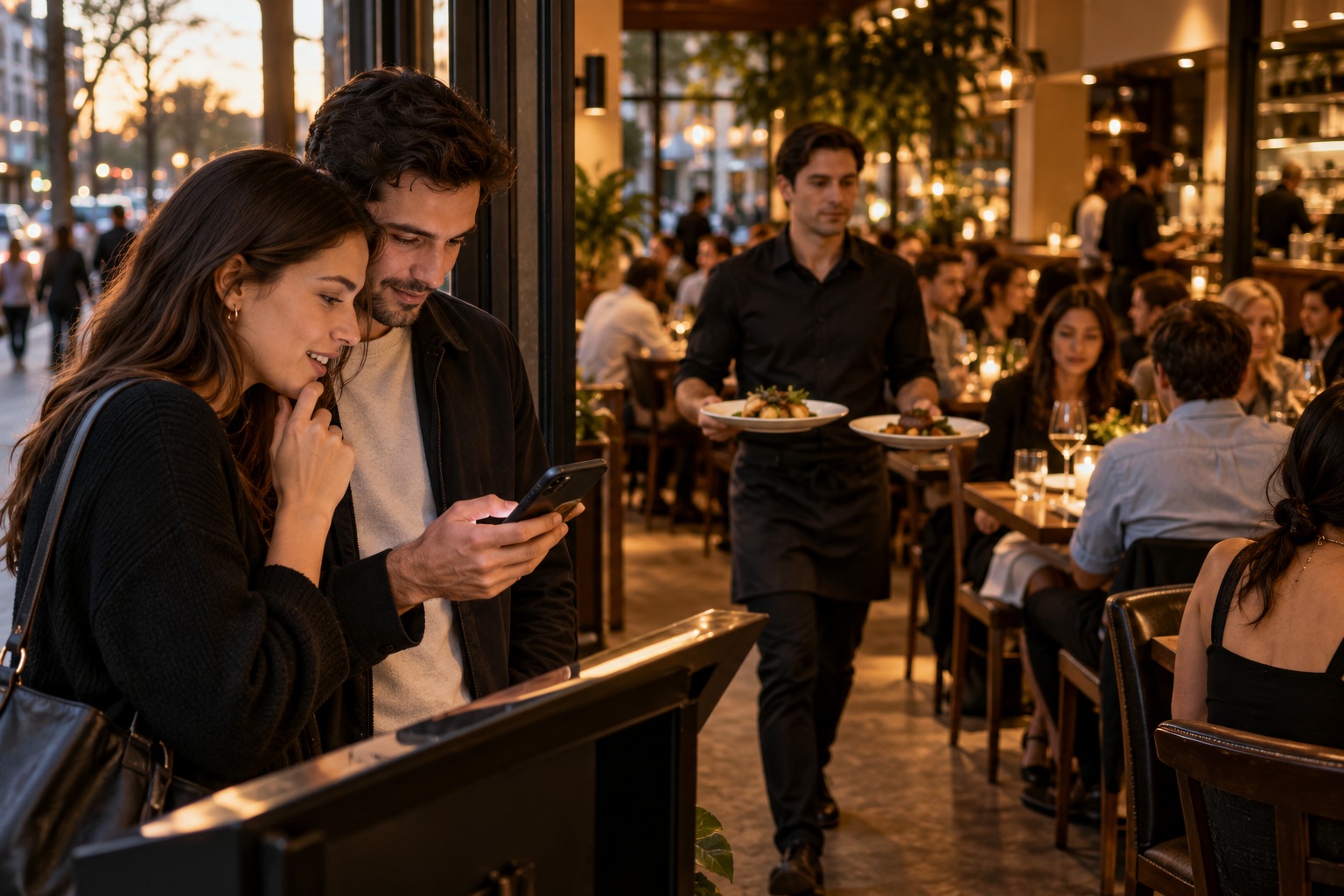
For a venue, the density of the competition is what changes. The next kitchen is a minute’s walk away.
Most of the decision happens in the few minutes before a walk-in or a booking. That is exactly when nobody in the building can get to the phone. The customer has three or four tabs open and is closing them one at a time. A menu that will not load on a phone is a tab closed.
So the question is not whether your site looks nicer than the one next door. It is whether it answers faster. Current menu, hours, one clear booking path, and an honest sense of what the room is like on the night.
The operational detail has its own piece on why a restaurant website has to work during service. It covers the parts that matter in the middle of a shift, and it is worth reading before you brief anyone.

Whatever the trade, two things happen before your website is opened at all.
The first is your Google Business Profile. That is the free listing carrying your hours, photos, reviews and map pin in search results. Some customers find their answer there and never reach your site. Keep it current, because it makes the introduction for you.
The second is page load time, which is how long a page takes to appear on a phone using mobile data. On a crowded street, on a slow connection, a heavy page loses the visit before it starts.
Neither one replaces the website. The profile carries the short answers. The site carries what a listing has no room for: the practitioner, the menu, the price, the booking. For the mechanics of the listing itself, read how Melbourne service businesses show up in Google’s map pack.
One question comes up a lot on a strip that crosses several suburbs. Should you build a page for each suburb nearby? The short answer is no. The reasoning is set out in why the suburb next door decides how easily customers find you.
Here is a test worth running on your own site. Open your own site on a phone, on mobile data, standing outside your own shop. Do it at the hour your customers arrive, not at your desk on the office wi-fi. Count what the site answers before you have to scroll.
Getting-here information dates faster than anything else on the page. Hours change for a public holiday. A parking arrangement changes. A treatment price moves. The person who needs to fix that is you, on the day. A site built on WordPress, a system you log into and edit yourself, with a training session at handover, is what makes that possible.
Settle one more thing in writing before you start. CJ Digital’s web design page says the site is yours, with no lock-in contract. It also says you are free to host it or move it wherever you choose. Ask for the same from whoever you use. A site you cannot take with you is not an asset you own.
Hours, then price or menu, then the way to book or get in touch. Those three carry most of the questions people arrive with. Everything else can sit below them.
Yes. A window sells the look of the place. It cannot answer a question asked from home, or from the other end of the street. The site settles hours, stock and price before anyone commits to the walk.
Three things: whether you are open, what it is likely to cost, and whether there is room for them now. A site that buries any of the three hands the decision to whoever answers faster.
Either route works, as long as the customer never has to hunt for it. Put one booking path in front of them and make sure it behaves on a phone. The system behind it matters less than how quickly someone reaches it.